Bootstrap 5 dropdown だけを使用する
はじめに
とあるプロジェクトで、UI コンポーネントは既に用意されていましたが、ドロップダウンリストだけがありませんでした。
- Bootstrap の Dropdown を使用したい
- Bootstrap の他のコンポーネントは使用したくない
- Bootstrap のバージョンは 5.3
なぜ Bootstrap の Dropdown を使いたいかというと、スクロールした時にリストがディスプレイからはみ出ないように、リストの表示位置を上(あるいは下)に自動的に変更してくれるからです(左右も自動調整してくれます)。この機能をゼロから自作するのはそれなりに手間 1 ですから手っ取り早く Bootstrap の Dropdown を導入したい。ただし、Bootstrap の他のコンポーネントは要らない、というケースがありましたので、Bootstrap の Dropdown だけを導入する手順を紹介します。
React(TypeScript + Vite)を例にします。
1Bootstrap のインストール
npm install bootstrap
Dropdown のソースファイルは以下の2つになります。
- node_modules/bootstrap/js/dist/dropdown.js
- node_modules/bootstrap/scss/_dropdown.scss
2dropdown.js の import
dropdown.js を import します。
// main.tsx
import 'bootstrap/js/dist/dropdown.js'
html は Dropdowns · Bootstrap v5.3 のサンプルコードをそのまま使用しました。
// app.tsx
function App() {
    return (
        <div className="dropdown">
            <button className="btn btn-secondary dropdown-toggle" type="button" data-bs-toggle="dropdown" aria-expanded="false">
                Dropdown button
            </button>
            <ul className="dropdown-menu">
                <li><a className="dropdown-item" href="#">Action</a></li>
                <li><a className="dropdown-item" href="#">Another action</a></li>
                <li><a className="dropdown-item" href="#">Something else here</a></li>
            </ul>
        </div>
    )
}

export default App
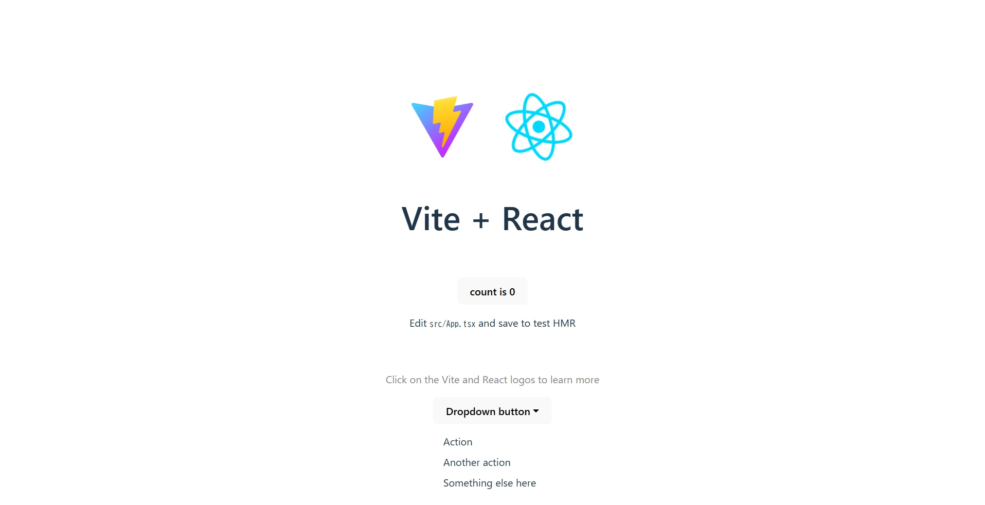
スタイルを指定していないので、初期表示でリストが見えてしまっている状態です(図1)。
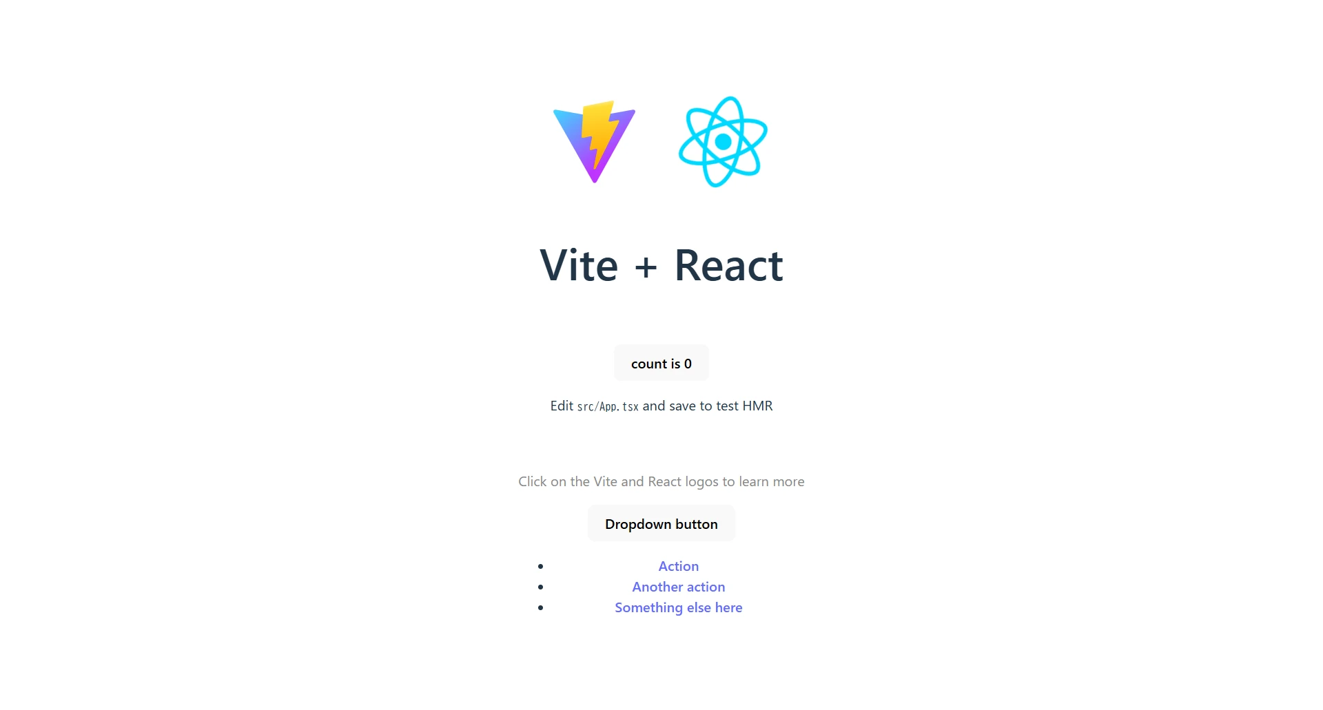
ただし、ドロップダウンの機能としては完成していて、リストがディスプレイ外に出ない制御も行われています。
自前でスタイルを作成することも可能ですが、ここでは Bootstrap のスタイルを適用してみます。
3Sass(scss)のインストール
Vite が scss ファイルをビルドするために Sassをインストールします。
npm install --save-dev sass
_dropdown.scss を参照してみましょう。
// main.tsx
import 'bootstrap/js/dist/dropdown.js'
import 'bootstrap/scss/_dropdown.scss'
実行すると、以下のエラーになります。
[plugin:vite:css] [sass] Undefined mixin.
   ╷
15 │   @include caret();
   │   ^^^^^^^^^^^^^^^^
   ╵
  node_modules\bootstrap\scss\_dropdown.scss 15:3  root stylesheet
_dropdown.scss は単体で使用するものではなく、他の scss ファイルも import して使用する前提になっているのが原因です。
4scss ファイルの作成
ビルドが通るように必要な他のファイルも import する新しい scss ファイルを作成します。
ファイル名は src/dropdown.scss としました。
// src/dropdown.scss
@import "../node_modules/bootstrap/scss/functions";
@import "../node_modules/bootstrap/scss/variables";
@import "../node_modules/bootstrap/scss/mixins";
@import "../node_modules/bootstrap/scss/dropdown";
この 4 ファイルでビルドが通るようになります。
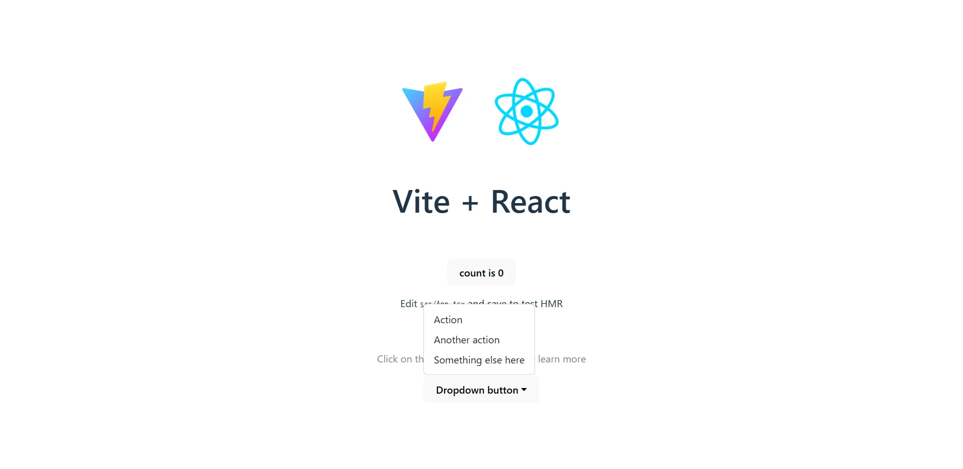
実行すると以下のようになります(図2)。
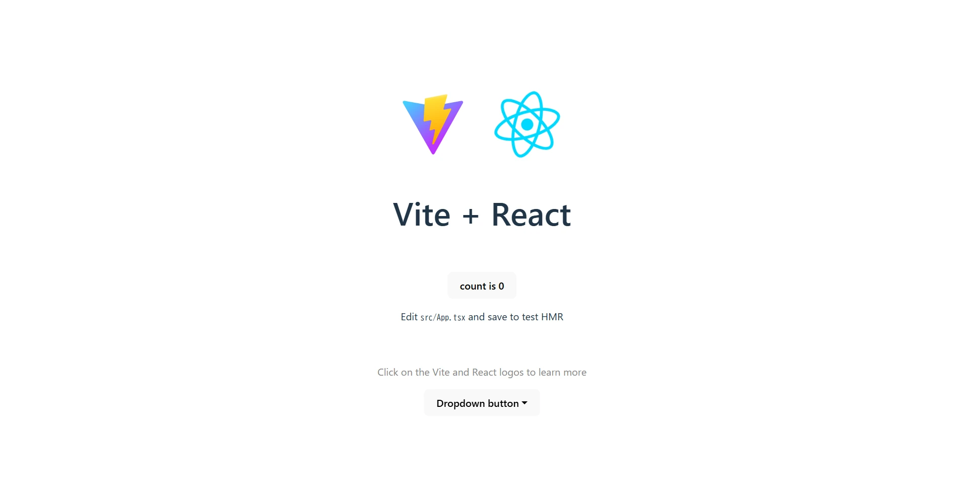
ボタンをクリックするとリストが表示されます(図3)。
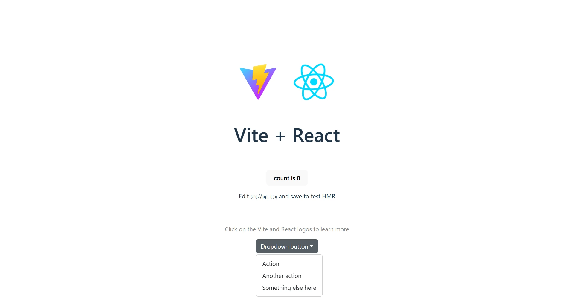
ブラウザのサイズを小さくするとリストが上に表示されます。
これは期待した動作ですが、リストの背景が透明になっているのが分かります(図4)。

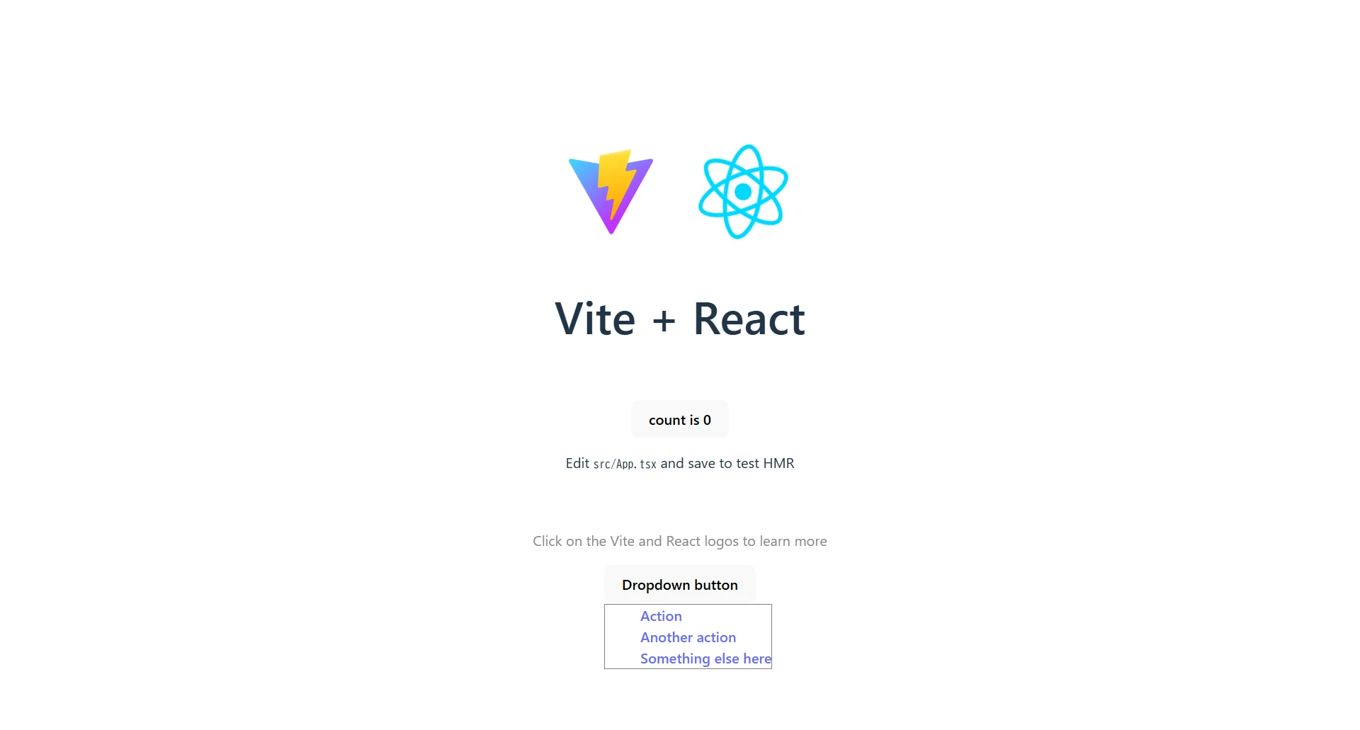
root と maps を追加します。
// src/dropdown.scss
@import "../node_modules/bootstrap/scss/functions";
@import "../node_modules/bootstrap/scss/variables";
@import "../node_modules/bootstrap/scss/maps";
@import "../node_modules/bootstrap/scss/mixins";
@import "../node_modules/bootstrap/scss/root";
@import "../node_modules/bootstrap/scss/dropdown";
これでリストに背景(と枠線)が設定されるようになりました(図5)。
ボタンには btn btn-secondary を指定しています。
Bootstrap のボタンのスタイルを適用するには buttons を追加します。
// src/dropdown.scss
@import "../node_modules/bootstrap/scss/functions";
@import "../node_modules/bootstrap/scss/variables";
@import "../node_modules/bootstrap/scss/maps";
@import "../node_modules/bootstrap/scss/mixins";
@import "../node_modules/bootstrap/scss/root";
@import "../node_modules/bootstrap/scss/buttons";
@import "../node_modules/bootstrap/scss/dropdown";
これで完全に Bootstrap と同じデザインになります。
独自のスタイルを適用
Bootstrap の scss ファイルを使用せずに、独自のスタイルを適用することもできます。
リストの表示時には dropdown-menu に show クラスが設定されるので、それを条件に表示/非表示を切り替えます。
// src/dropdown.scss
.dropdown-menu {
    display: none;

    &.show {
        display: block;
        background: white;
        border: 1px solid gray;

        li {
            list-style: none;
            text-align: left;
        }
    }
}
最小限のスタイル指定ですが、以下のような見た目になります(図7)。
ここからお好みのスタイルにブラッシュアップしていくこともできます。
脚注
-
Bootstrap も
Popper.jsというライブラリを使用して実現しているそうです。↩