PCSS color tone and RGB
Table of Contents
Introduction
RGB (Red・Green・Blue)
When expressing colors on computers such as PCs and smartphones, RGB is the standard method. This is because displays represent colors by combining the three primary colors of light: ■R (red), ■G (green), and ■B (blue). However, this RGB is not always intuitive from a human perspective.
For example, ■yellow is created by mixing ■R (red) and ■G (green), which does not always align with human color perception (based on the three primary colors of paint). Also, if you want to brighten the color a bit more, few people can intuitively guess how to adjust the RGB values to increase only the lightness without changing the hue.
HSL (Hue・Saturation・Lightness)
HSL is one of the color spaces that expresses color in a way closer to human perception. HSL expresses color using three elements: Hue, Saturation, and Lightness. Therefore, you can adjust the vividness and brightness of the color without changing the hue.
However, another problem arises here. Even if saturation and lightness are numerically aligned between multiple colors (hues), they are often not perceived as the same tone (vividness/brightness) by the human eye. This is because human color perception differs in how vividness and brightness are felt depending on the hue. For example, yellow appears brighter than blue or red, even with the same saturation and lightness.
| Color Name | RGB | HSL (Same Saturation & Lightness) | Perceived Brightness |
|---|---|---|---|
| Yellow ■ | 255, 255, 0 | 60°, 1.0, 0.5 | Bright |
| Red ■ | 255, 0, 0 | 0°, 1.0, 0.5 | Medium |
| Blue ■ | 0, 0, 255 | 240°, 1.0, 0.5 | Dark |
Because human color perception has these characteristics, it is difficult to achieve harmonious color schemes even if the saturation and lightness of different hues are aligned. PCCS is one of the solutions to this.
PCCS (Practical Color Co-ordinate System)
What is PCCS (Japan Color Research Institute Color System) | Japan Color Research Institute
PCCS (Practical Color Co-ordinate System) is characterized by being a Hue-Tone System that systematically organizes the emotional effects colors have on us into two categories: Hue and Tone. While Munsell color systems and others represent colors by three attributes—hue, lightness, and saturation—PCCS can systematically display colors along two axes, Hue and Tone. This allows for an overview of the world of color and makes it easier to understand the relationships between colors, facilitating the creation of color harmony and color classification schemes.
The key point of PCCS is that it expresses color using two axes: Hue and Tone. Tone is a concept that encompasses saturation and lightness. By aligning Tone across different hues, visual harmony becomes easier to achieve. The relationship between Hue, Tone, Saturation, and Lightness is shown in the following figure (Figure 1.).
Figure 1. Tone diagram by Japan Color Research Institute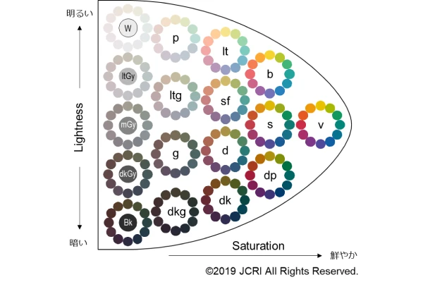
In Figure 1., Tone is represented by abbreviations such as v, b, s, and dp. Around these abbreviations, twelve colors sharing the same Tone are arranged in a circular pattern. As you can see, all colors with the same Tone appear to have approximately the same saturation and lightness. A set of colors with the same saturation and lightness forms a Tone.
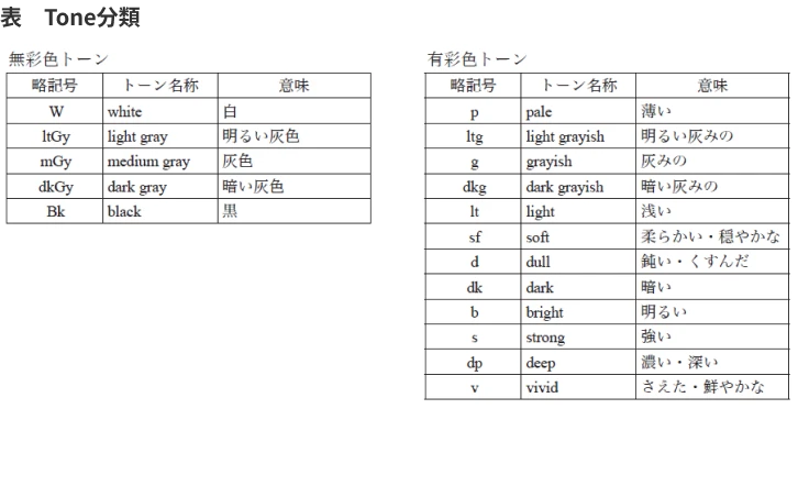
In PCCS, twelve Tones are defined for chromatic colors, and five Tones for achromatic colors (Figure 2.).
Thinking with Tone as an axis offers the advantage of making it easier to create color schemes that match saturation and lightness. However, in general computer and programming environments, Hue and Tone cannot be specified directly. They must be converted to RGB or similar values before specification. I wanted to know the exact RGB values for each Hue and Tone combination (i.e., color tone), so I did some research.
Japan Color Research Institute (JCRI)
The RGB values for PCCS can be found in the document 1 downloadable from the National Diet Library.
They generally matched the RGB values extracted from the image in Figure 1.
(※The colors in image files may consist of multiple colors where each RGB value differs subtly (by about 1 to 3 numerically), even in areas that appear as the same color to the human eye. Therefore, there may be errors when extracting RGB values from image files.)
As an example, the RGB values for Vivid Tone and the HSL values calculated from them are shown below.
| Color Name | R | G | B | RGB (Hex) | H | S | L |
|---|---|---|---|---|---|---|---|
| ■ V2 | 205 | 45 | 71 | #CD2D47 | 350 | 64 | 49 |
| ■ V4 | 230 | 89 | 34 | #E65922 | 16 | 80 | 52 |
| ■ V6 | 239 | 154 | 11 | #EF9A0B | 35 | 91 | 49 |
| ■ V8 | 233 | 195 | 0 | #E9C300 | 50 | 100 | 46 |
| ■ V10 | 167 | 184 | 0 | #A7B800 | 66 | 100 | 36 |
| ■ V12 | 15 | 153 | 93 | #0F995D | 160 | 82 | 33 |
| ■ V14 | 3 | 133 | 123 | #03857B | 175 | 95 | 27 |
| ■ V16 | 6 | 115 | 143 | #06738F | 191 | 92 | 29 |
| ■ V18 | 16 | 93 | 163 | #105DA3 | 211 | 82 | 35 |
| ■ V20 | 80 | 74 | 158 | #504A9E | 245 | 37 | 45 |
| ■ V22 | 126 | 55 | 136 | #7E3788 | 293 | 43 | 37 |
| ■ V24 | 170 | 45 | 106 | #AA2D6A | 330 | 58 | 42 |
DIC Color Design Inc.
What is PCCS | Color Related Information | DIC Color Design Inc.
Figure 3. PCCS Tone Map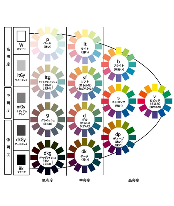
Even with the same Vivid Tone, it is a brighter tone compared to the Japan Color Research Institute. All other tones introduced hereafter also use brighter colors compared to those from the Japan Color Research Institute. PCCS was originally developed by the Japan Color Research Institute, but it seems that the PCCS widely adopted in general uses brighter colors than the original.
| Color | R | G | B | RGB (Hex) | H | S | L |
|---|---|---|---|---|---|---|---|
| ■ | 233 | 0 | 63 | #E9003F | 344 | 100 | 46 |
| ■ | 240 | 77 | 3 | #F04D03 | 19 | 98 | 48 |
| ■ | 250 | 154 | 2 | #FA9A02 | 37 | 98 | 49 |
| ■ | 255 | 229 | 1 | #FFE501 | 54 | 100 | 50 |
| ■ | 191 | 212 | 2 | #BFD402 | 66 | 98 | 42 |
| ■ | 1 | 148 | 83 | #019453 | 153 | 99 | 29 |
| ■ | 0 | 127 | 132 | #007F84 | 182 | 100 | 26 |
| ■ | 1 | 108 | 163 | #016CA3 | 200 | 99 | 32 |
| ■ | 3 | 81 | 157 | #03519D | 210 | 96 | 31 |
| ■ | 71 | 59 | 134 | #473B86 | 250 | 39 | 38 |
| ■ | 122 | 43 | 122 | #7A2B7A | 300 | 48 | 32 |
| ■ | 182 | 1 | 89 | #B60159 | 331 | 99 | 36 |
+Colors
Relationships between Tones, Lightness, and Saturation | +Colors
Figure 4. +Colors Vivid Tone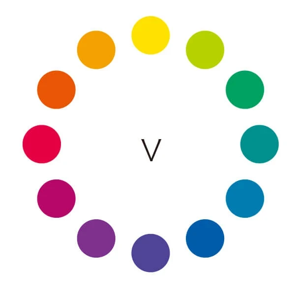
| Color | R | G | B | RGB (Hex) | H | S | L |
|---|---|---|---|---|---|---|---|
| ■ | 234 | 86 | 6 | #EA5606 | 21 | 95 | 47 |
| ■ | 244 | 161 | 2 | #F4A102 | 39 | 98 | 48 |
| ■ | 255 | 225 | 1 | #FFE101 | 53 | 100 | 50 |
| ■ | 182 | 209 | 0 | #B6D100 | 68 | 100 | 41 |
| ■ | 0 | 162 | 98 | #00A262 | 156 | 100 | 32 |
| ■ | 1 | 145 | 142 | #01918E | 179 | 99 | 29 |
| ■ | 1 | 124 | 176 | #017CB0 | 198 | 99 | 35 |
| ■ | 0 | 92 | 170 | #005CAA | 208 | 100 | 33 |
| ■ | 80 | 69 | 152 | #504598 | 248 | 38 | 43 |
| ■ | 127 | 49 | 141 | #7F318D | 291 | 48 | 37 |
| ■ | 183 | 7 | 105 | #B70769 | 327 | 93 | 37 |
| ■ | 229 | 0 | 66 | #E50042 | 343 | 100 | 45 |
321Web
【Useful for Design】Types and Characteristics of Color Tones【Color Schemes based on Tones】 | 321web
Figure 5. 321Web Vivid Tone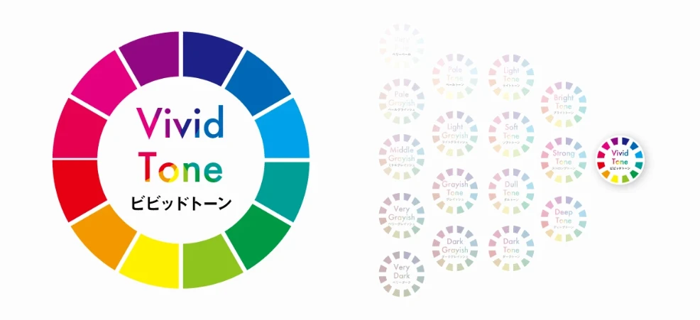
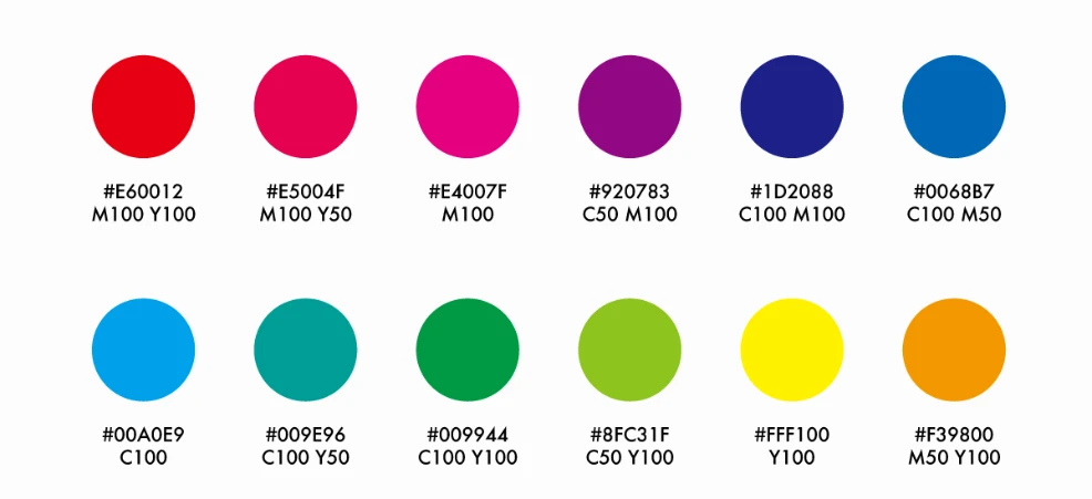
Putting aside the point that the hue rotation direction is reversed, yellow is in the third position, and a different hue has been selected compared to previous examples. The table below adjusts the hue rotation direction to match the others.
| Color | R | G | B | RGB (Hex) | H | S | L |
|---|---|---|---|---|---|---|---|
| ■ | 231 | 0 | 19 | #E70013 | 355 | 100 | 45 |
| ■ | 243 | 152 | 0 | #F39800 | 38 | 100 | 48 |
| ■ | 254 | 241 | 0 | #FEF100 | 57 | 100 | 50 |
| ■ | 142 | 196 | 30 | #8EC41E | 80 | 73 | 44 |
| ■ | 0 | 153 | 68 | #009944 | 147 | 100 | 30 |
| ■ | 0 | 158 | 150 | #009E96 | 177 | 100 | 31 |
| ■ | 0 | 161 | 234 | #00A1EA | 199 | 100 | 46 |
| ■ | 0 | 103 | 182 | #0067B6 | 206 | 100 | 36 |
| ■ | 29 | 32 | 136 | #1D2088 | 238 | 65 | 32 |
| ■ | 146 | 7 | 131 | #920783 | 306 | 91 | 30 |
| ■ | 228 | 0 | 127 | #E4007F | 327 | 100 | 45 |
| ■ | 230 | 0 | 80 | #E60050 | 339 | 100 | 45 |
Iro Color
Hue Color Chart by Tone | Iro Color
Figure 5. Iro Color Vivid Tone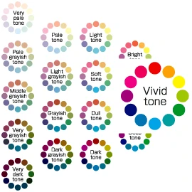
Here too, yellow is in the third position in the color scheme.
| Color | R | G | B | RGB (Hex) | H | S | L |
|---|---|---|---|---|---|---|---|
| ■ | 239 | 1 | 1 | #EF0101 | 0 | 99 | 47 |
| ■ | 252 | 160 | 1 | #FCA001 | 38 | 99 | 50 |
| ■ | 255 | 245 | 0 | #FFF500 | 58 | 100 | 50 |
| ■ | 158 | 199 | 1 | #9EC701 | 72 | 99 | 39 |
| ■ | 1 | 149 | 36 | #019524 | 134 | 99 | 29 |
| ■ | 0 | 158 | 159 | #009E9F | 180 | 100 | 31 |
| ■ | 0 | 163 | 231 | #00A3E7 | 198 | 100 | 45 |
| ■ | 0 | 115 | 179 | #0073B3 | 201 | 100 | 35 |
| ■ | 0 | 11 | 119 | #000B77 | 234 | 100 | 23 |
| ■ | 163 | 0 | 121 | #A30079 | 315 | 100 | 32 |
| ■ | 240 | 1 | 130 | #F00182 | 328 | 99 | 47 |
| ■ | 239 | 0 | 90 | #EF005A | 337 | 100 | 47 |
Kami Sommelier
What is a Color System? Explaining the Knowledge Needed for Color Matching - Kami Sommelier
Figure 6. Kami Sommelier Vivid Tone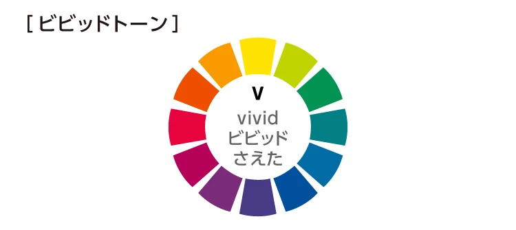
| Color | R | G | B | RGB (Hex) | H | S | L |
|---|---|---|---|---|---|---|---|
| ■ | 238 | 77 | 0 | #EE4D00 | 19 | 100 | 47 |
| ■ | 250 | 154 | 0 | #FA9A00 | 37 | 100 | 49 |
| ■ | 254 | 227 | 2 | #FEE302 | 54 | 99 | 50 |
| ■ | 191 | 212 | 0 | #BFD400 | 66 | 100 | 42 |
| ■ | 2 | 147 | 83 | #029353 | 154 | 97 | 29 |
| ■ | 3 | 127 | 133 | #037F85 | 183 | 96 | 27 |
| ■ | 1 | 108 | 165 | #016CA5 | 201 | 99 | 33 |
| ■ | 1 | 80 | 158 | #01509E | 210 | 99 | 31 |
| ■ | 73 | 58 | 134 | #493A86 | 252 | 40 | 38 |
| ■ | 122 | 43 | 122 | #7A2B7A | 300 | 48 | 32 |
| ■ | 182 | 1 | 89 | #B60159 | 331 | 99 | 36 |
| ■ | 231 | 3 | 62 | #E7033E | 344 | 97 | 46 |
Karahom M
Color for Invisible Man 【Karahom M】
Figure 7.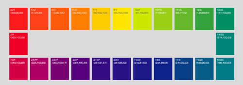
24-color version.
| Color | R | G | B | RGB (Hex) | H | S | L |
|---|---|---|---|---|---|---|---|
| ■ | 252 | 26 | 28 | #FC1A1C | 359 | 97 | 55 |
| ■ | 254 | 65 | 25 | #FE4119 | 10 | 99 | 55 |
| ■ | 255 | 89 | 11 | #FF590B | 19 | 100 | 52 |
| ■ | 255 | 127 | 0 | #FF7F00 | 30 | 100 | 50 |
| ■ | 255 | 204 | 0 | #FFCC00 | 48 | 100 | 50 |
| ■ | 254 | 230 | 0 | #FEE600 | 54 | 100 | 50 |
| ■ | 204 | 232 | 0 | #CCE800 | 67 | 100 | 45 |
| ■ | 153 | 207 | 21 | #99CF15 | 77 | 82 | 45 |
| ■ | 102 | 183 | 42 | #66B72A | 94 | 63 | 44 |
| ■ | 51 | 162 | 60 | #33A23C | 125 | 52 | 42 |
| ■ | 0 | 143 | 99 | #008F63 | 162 | 100 | 28 |
| ■ | 0 | 134 | 120 | #008678 | 174 | 100 | 26 |
| ■ | 0 | 122 | 135 | #007A87 | 186 | 100 | 26 |
| ■ | 6 | 93 | 136 | #065D88 | 200 | 92 | 28 |
| ■ | 9 | 63 | 135 | #093F87 | 214 | 88 | 28 |
| ■ | 15 | 34 | 139 | #0F228B | 231 | 81 | 30 |
| ■ | 29 | 25 | 136 | #1D1988 | 242 | 69 | 32 |
| ■ | 41 | 18 | 134 | #291286 | 252 | 76 | 30 |
| ■ | 52 | 11 | 129 | #340B81 | 261 | 84 | 27 |
| ■ | 86 | 0 | 125 | #56007D | 281 | 100 | 25 |
| ■ | 119 | 1 | 113 | #770171 | 303 | 98 | 24 |
| ■ | 175 | 0 | 101 | #AF0065 | 325 | 100 | 34 |
| ■ | 211 | 0 | 69 | #D30045 | 340 | 100 | 41 |
| ■ | 239 | 0 | 39 | #EF0027 | 350 | 100 | 47 |
Summary
Comparing the RGB values of each Vivid Tone revealed that different color shades are adopted by each. Since PCCS is not an international standard, it's best to assume that there are no fixed numerical values. Therefore, in design practice, it seems best to use PCCS color names and tone classifications as a guide, referring to samples and interpreting them flexibly.
For extracting colors from image files, I used the Image Color Analysis Tool | Korochin Site. (※RGB data for all tones other than Vivid Tone will be published in a different form at a later date.)
References
PCCS - Wikipedia PCCS (Japan Color Research Institute Color System) ~ Various Color Systems vol.1 | COCOLOR What is PCCS (Color Circle, Tone Concept Diagram) | Color 101®|Color Coordination and Color Learning PCCS-tone/Vivid Tone - IROUSE/DATABASE・Color harmony
